
OnSpot
Spontaneous Meetup App
Project Vision
Challenges
We aim to build an app that lets users easily create and join spontaneous events, both in person and online. By connecting people instantly for casual hangouts or virtual meetups, the app will foster real-time social connections and even offer deals with local businesses. Users will be able to discover new experiences around them and their communities, enriching their social lives effortlessly.
1)
Seamless Event Discovery: ensuring events match interests, location, and availability
2)
Designing UX elements that make users feel secure when joining events
3)
Notification Fatigue vs. Real-Time Relevance: creating a balance that feels intuitive
4)
Effortless Event Creation: Designing a clear process for creating spontaneous events
Defining the Project
In this stage, we analyzed user insights to identify challenges in spontaneous event creation and discovery. Using a user-centered design approach, we developed personas and user journeys to highlight pain points, focusing on simplifying event flows and improving engagement. These insights shaped our design goals and guided the ideation process. We started by asking key questions to determine the design direction.
"What is the product for and who is it for?"
"What challenges could we face moving forward?"
"How can we ensure that event discovery is personalized"
"How can we make the event creation process as intuitive as possible"
"How can we include deals without being invasive?"
"What are user pain points that we can solve?"
I began by asking 5 friends and/or potential users to list key things they would want to see on such an application. Using this an affinity diagram was created and separated into categories. Next, utilizing knowledge from trusted sites I identified initial pain points. These were compared with our firsthand findings, ultimately refining and clarifying what design elements were desired and/or needed.
Affinity Diagram
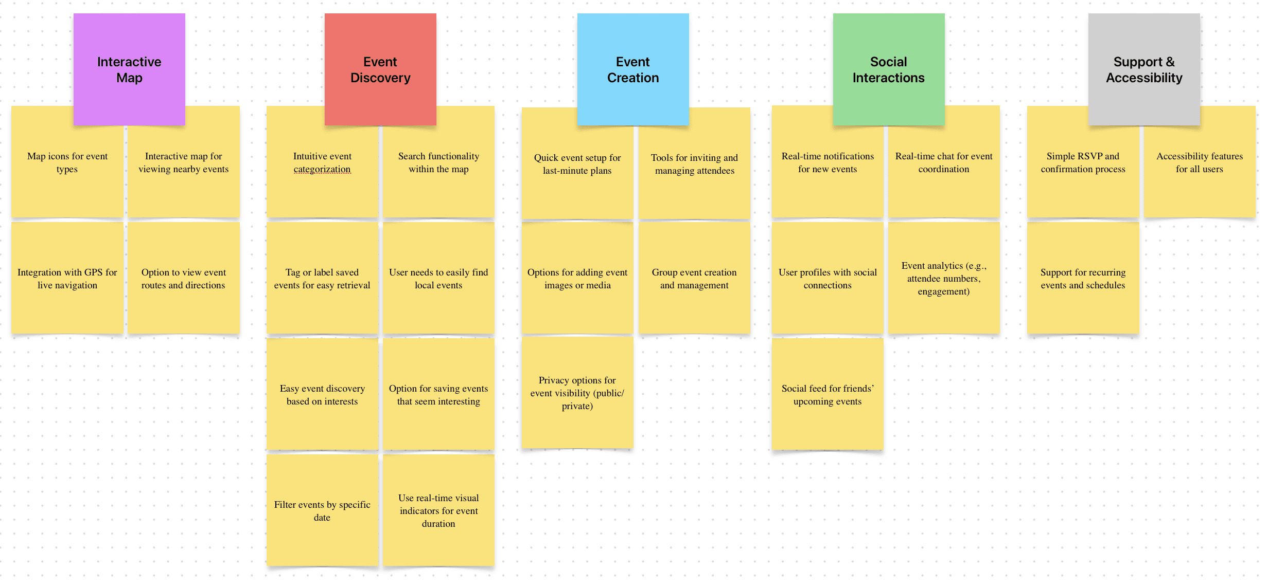
User Pain Points
1
Non-Intuitive Design
Solution:
We’ll conduct user testing to pinpoint struggles and focus on simplifying navigation, improving hierarchy, and ensuring a consistent, intuitive interface
2
Inaccessible Design
Solution:
We’ll perform accessibility tests and focus on color contrast, accessibility tools, and keyboard-friendly design.
3
Chaotic Variety
Solution:
We’ll analyze user behavior and feedback to improve product presentation with better filters, sorting, and clear categorization, as well as the inclusion of charts.
4
Poor Hierarchy
Solution:
We’ll use usability testing to identify user struggles and focus on clear labeling, navigation, and prominent information display.
Meet The Users
Primary

Name: Jess
Age: 23
Occupation: Student
“I want to do fun things, anytime & anywhere, even if it's last minute.”
Jess is a graduate planning a gap year before starting her masters. In Jess's free time she enjoys solo traveling and making new connections. Jess wants to meet people on the fly, easily and without hassle.
Goals
Frustrations
Clear navigation
Unclear details
Real time updates
Privacy concerns
Secondary

Name: Tim
Age: 31
Occupation: Designer
"I need to find cool events around me without all the usual clutter."
Tim is a graphic designer, who wants to create and join design meet-ups. Tim wants to explore different hot spots and meet new people doing so. He wants to find specific events and use deals to explore new locations.
Goals
Frustrations
Create groups
Irrelevant suggestions
Intuitive filtering
Invasive deals
Accessibility

Name: Sofia
Age: 28
Occupation: Trainer
"Low contrast makes it hard to plan quickly when I'm on the move."
Sofia is a personal trainer with low vision who relies on high-contrast settings and assistive technology when organizing workouts with clients. Sofia enjoys making connections and seeks to do so without hassle.
Goals
Frustrations
Access friendly
Poor colour contrast
Light & dark mode
Unclear Interactions
Competitive Analysis


After analysis I understood that by emphasizing spontaneity, real-time participation, and location-driven socializing, OneSpot can carve out a niche distinct from the more structured, pre-planned experiences offered by existing competitors.
Opportunities Found:
Instant Event Creation
Real-Time, Location-Based Discovery
Pop-Up Spontaneous Events
Integration with Local Venues & Deals
AI-Powered Instant Matchmaking


Preparing the Journey
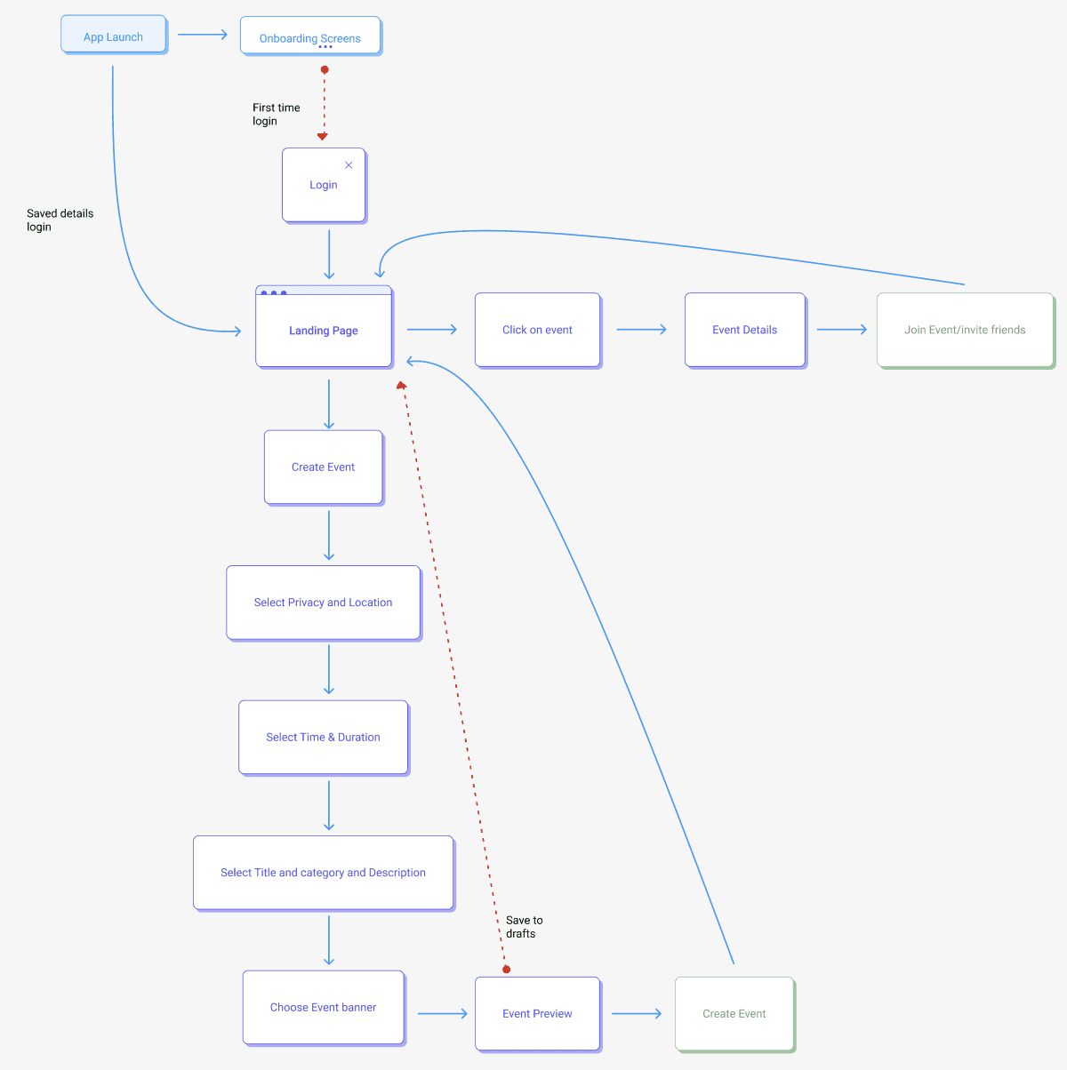
We constructed a user-flow of what a basic start to finish journey looks like while creating an event. This helps us in understanding ways users can interact with the product, as well as allowing us to see navigation through user goals.
User journey: Journey showing user path to creating or joining an event on OnSpot Application
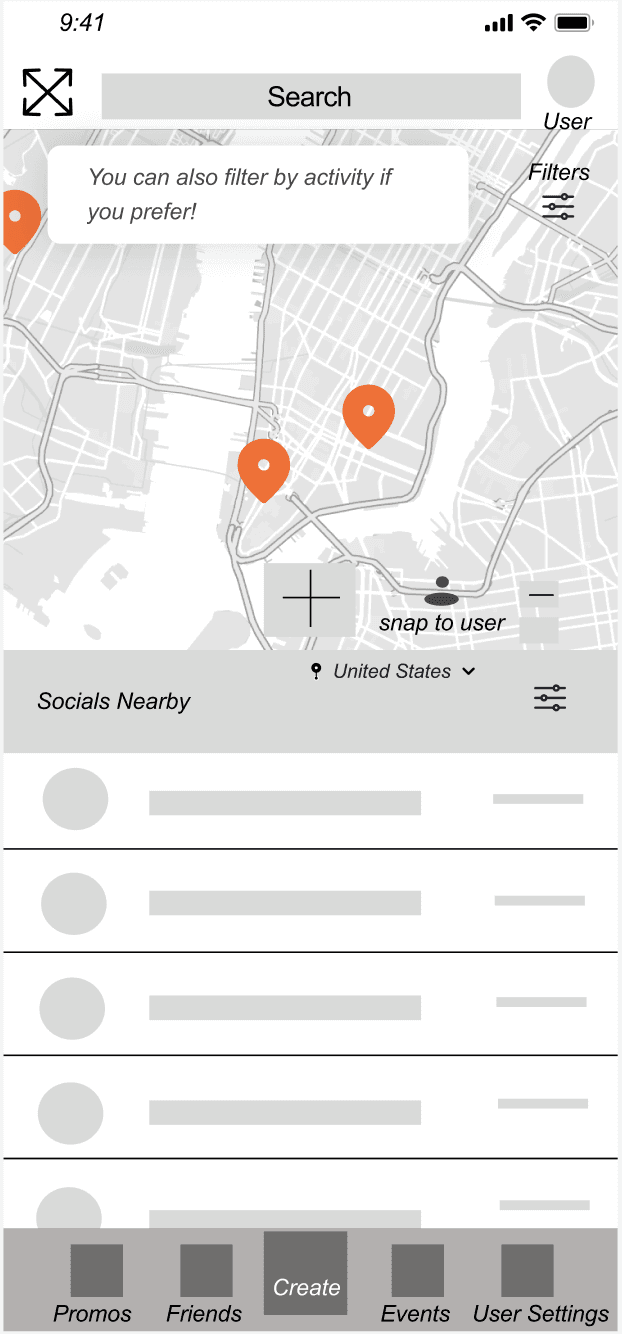
Low-Fidelity Wireframes
Low-fidelity Homepage
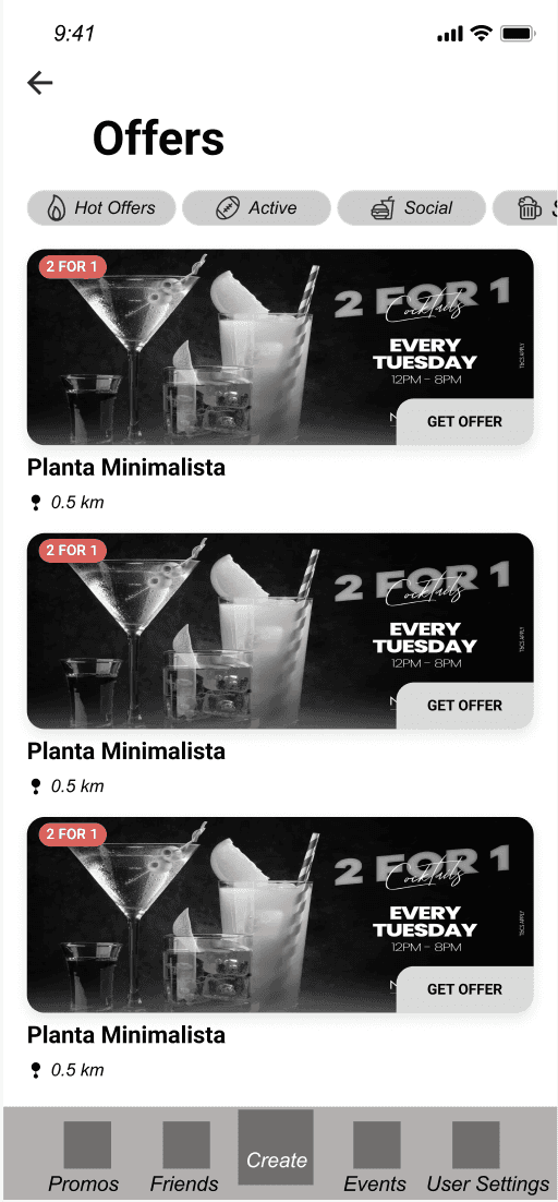
Low-fidelity Offers/Deals
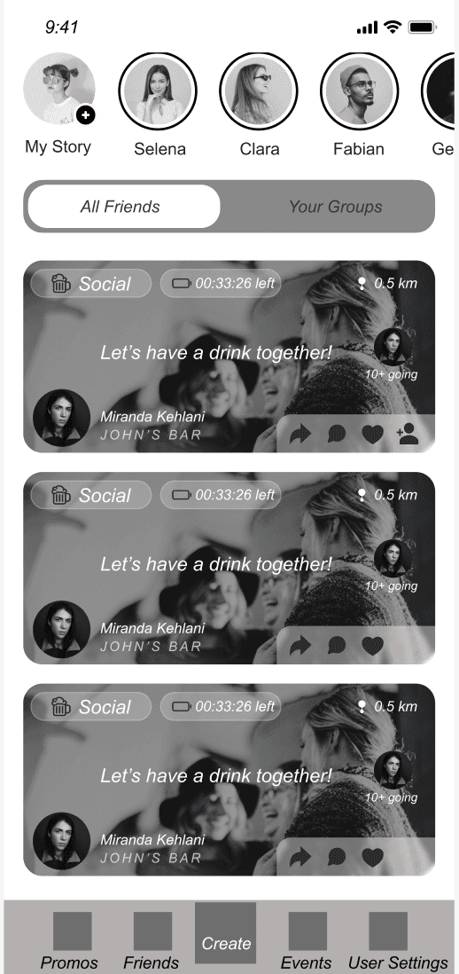
Low-fidelity Friends & Groups Page
Low-fidelity User Profile
Iteration
These wireframes and some more were tested in a small, moderated user study with 5 participants. Feedback focused on the ease of creating spontaneous events, navigating real-time event discovery, and the overall user flow. This testing helped identify areas for improvement in user engagement and streamlining the event creation process
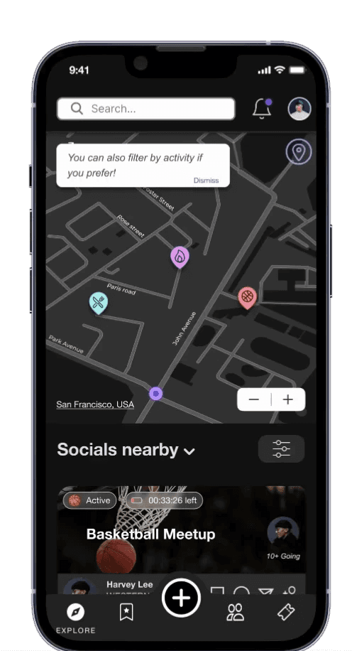
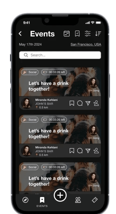
Enhance Event Discovery
We found that users struggled with visual clutter, making it hard for them to focus and navigate effectively.
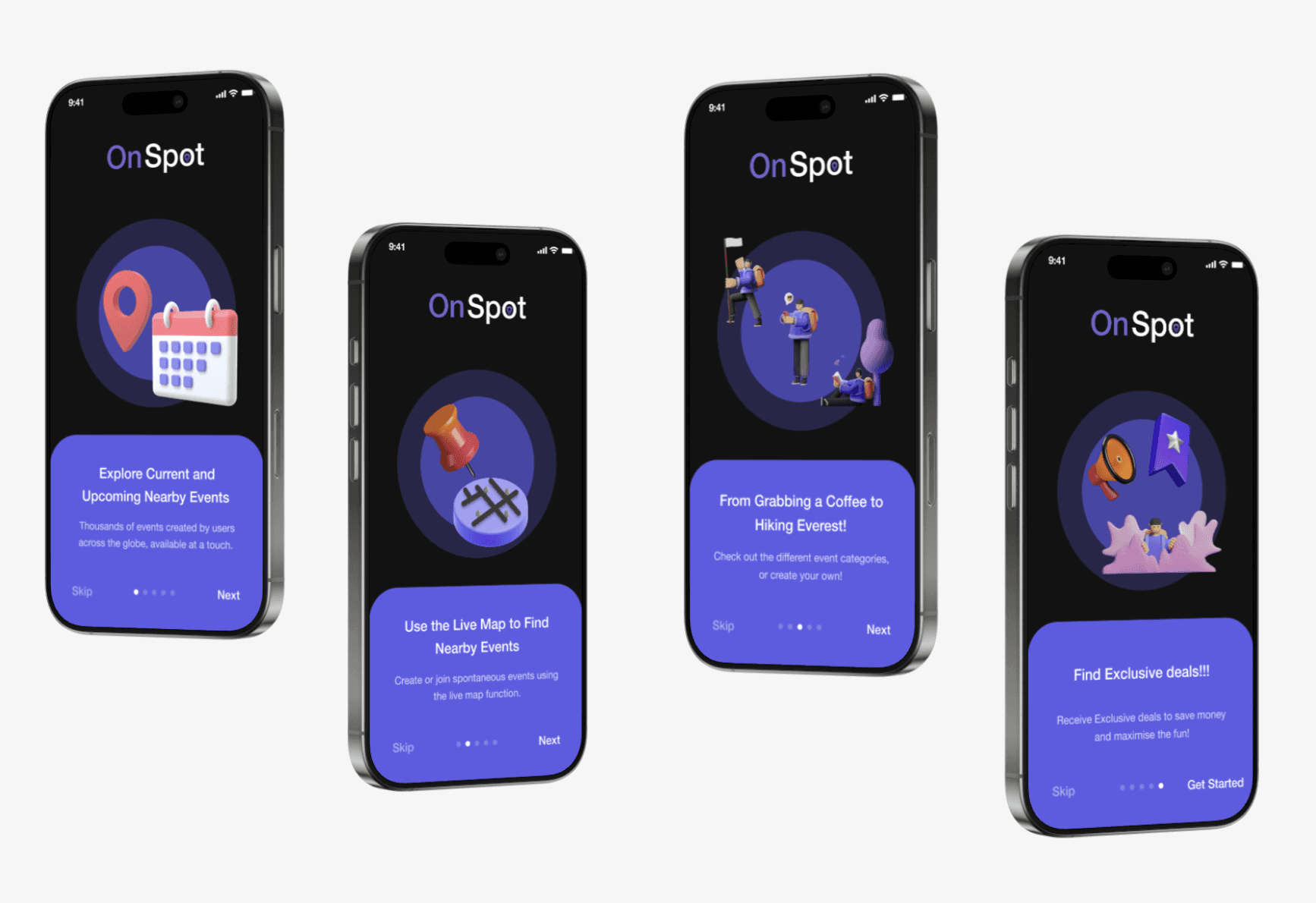
Introduce App Features
We discovered that users often felt overwhelmed and unsure of the possibilities provided. Thus requesting an app introduction.
Simplify Event Creation
We found that users struggled with event creation and found it tiring to fill in all the information on a singular screen.
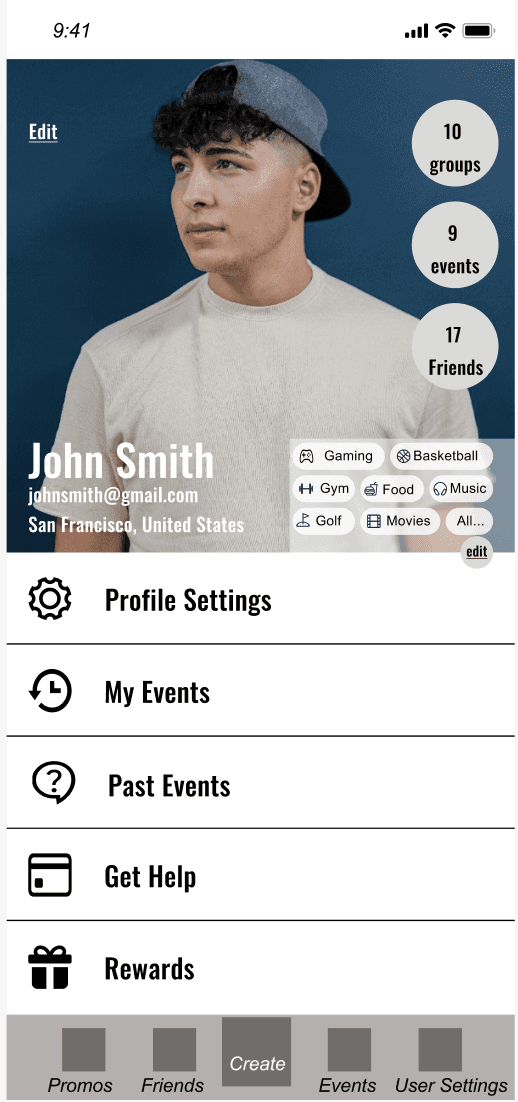
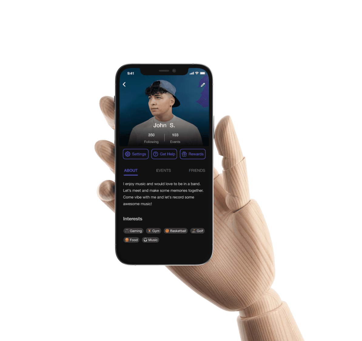
User Profiles
Users struggled with profiles and visual clutter present, leading to being overwhelmed and options being unclear.
Old User Profile Page
New User Profile Page
CHALLENGE 1
Enhance Event Discovery
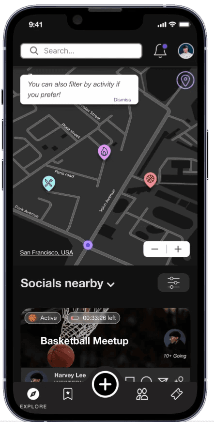
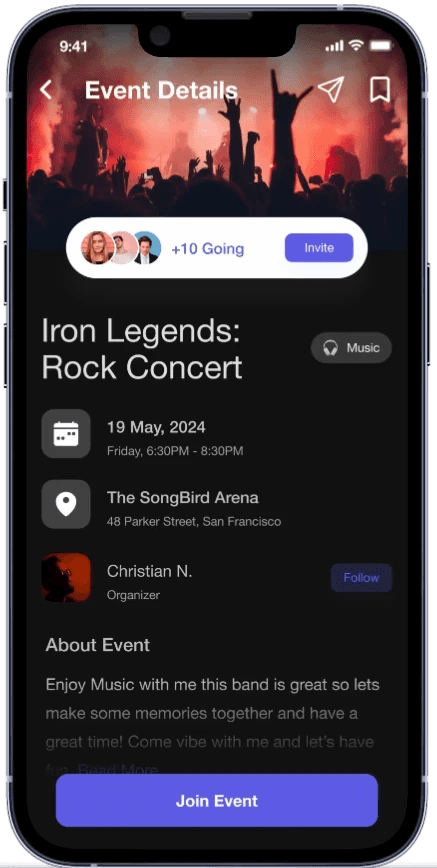
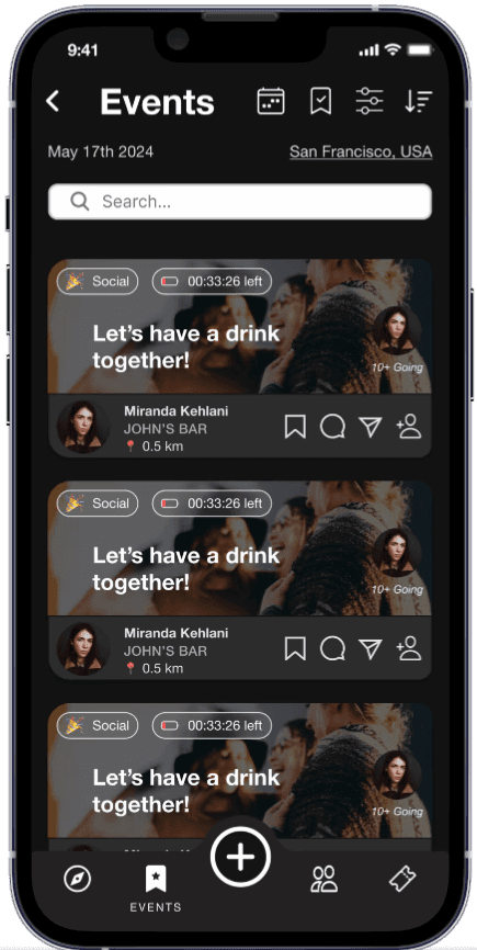
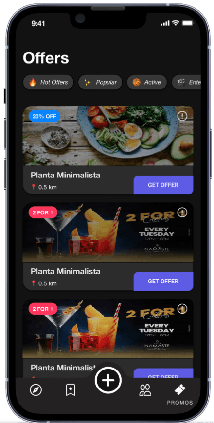
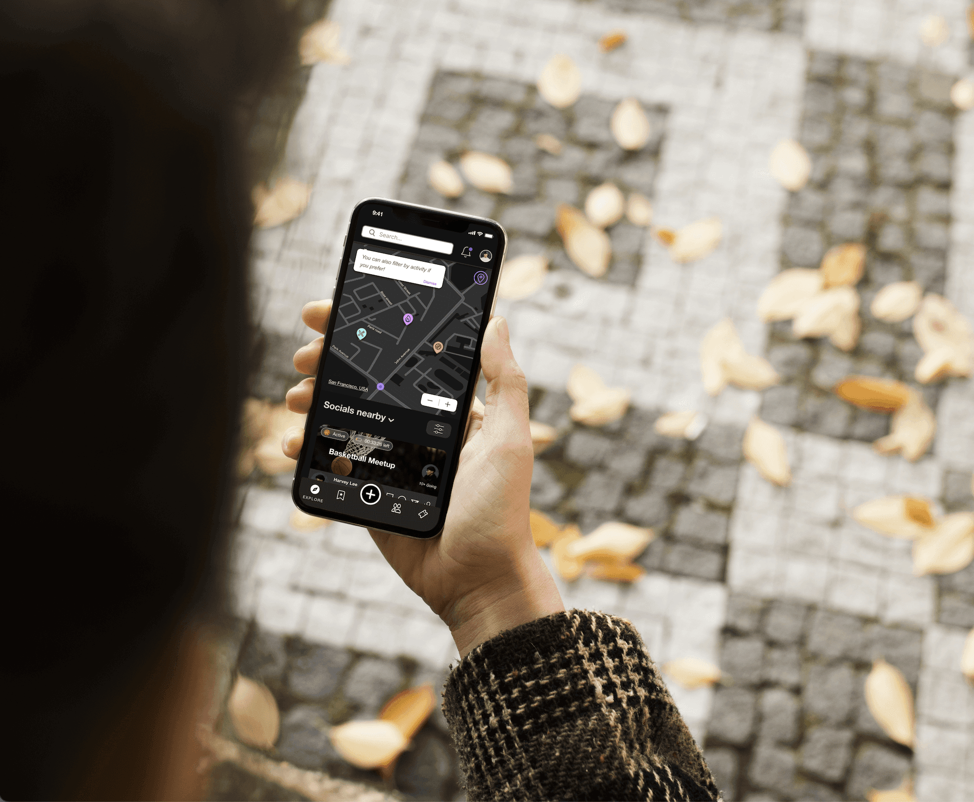
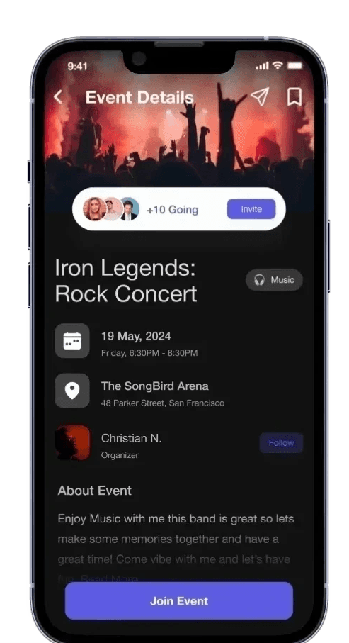
By adding negative space and making the filter options more accessible as well as enhancing our interactive map, we were able to increase the user friendliness of the app and aid the user to discover the events they sought after. Additionally, using user feedback, we colour coded the different deals, and made the event details more prominent to address safety and privacy concerns.
CHALLENGE 2
Introduce App Features
Focused on designing intuitive onboarding flows to introduce app features seamlessly. I prioritized clear visual cues, and concise language to guide users through new functionality. By incorporating user testing feedback, I ensured the experience was engaging and non-intrusive, helping users discover key features naturally while minimizing friction. This approach led to higher user adoption rates and a smoother overall app experience
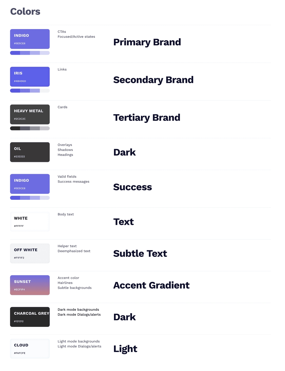
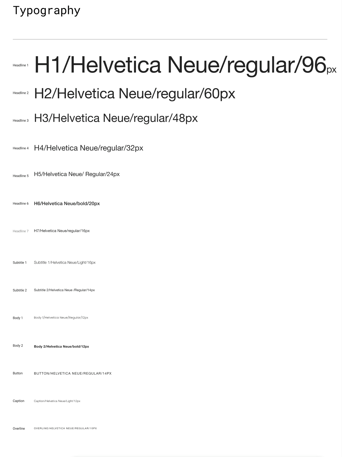
Style Guide
Using a style guide to ensure consistent, clear organization of content, improving readability and helping users quickly find key information and navigate the app.
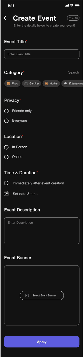
CHALLENGE 3
Simplify Event Creation
We initially believed that the event creation should all be done on a singular screen to quicken the process, but after testing discovered that users felt drained not having progress markers, therefore we paired the event creation themes and put 2 at most on each page to ease the creation process and ensure user satisfaction.
Prior to Testing
After Testing
CLICK to View
CHALLENGE 4
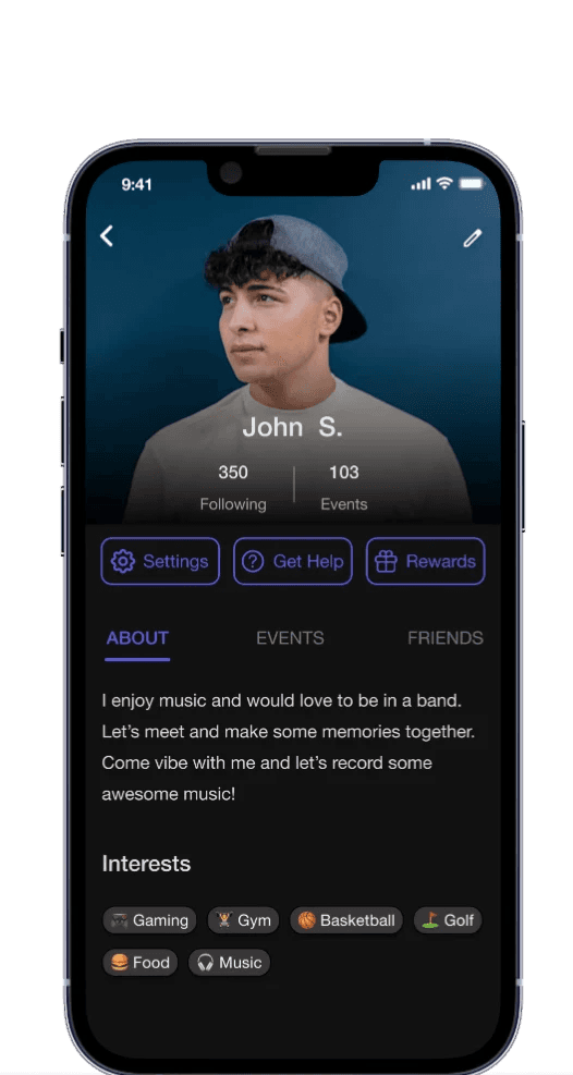
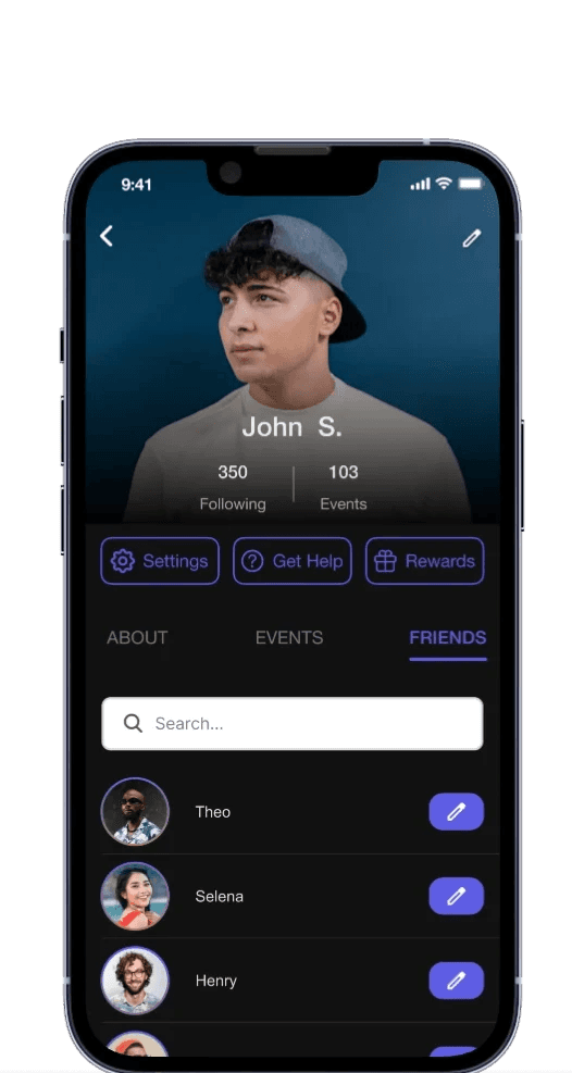
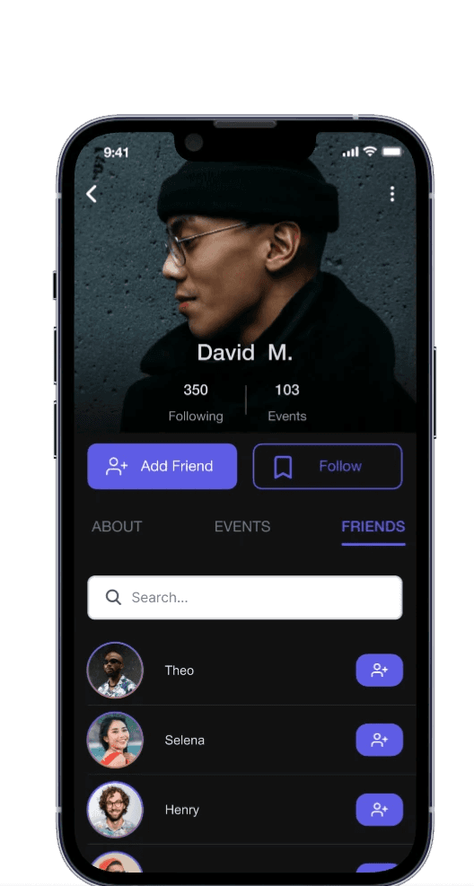
User Profiles
By adhering to Gestalt principles we reduced clutter on user profiles by simplifying the layout and prioritizing key actions. A streamlined and similar design made adding friends easier with a clear, single-click button. To address privacy concerns, we displayed essential information without sharing personal details, balancing transparency and user privacy. This improved usability and trust.
Profile of User
Stranger Profile

Profile of User (Friends Tab)
Stranger Profile (Friends Tab)
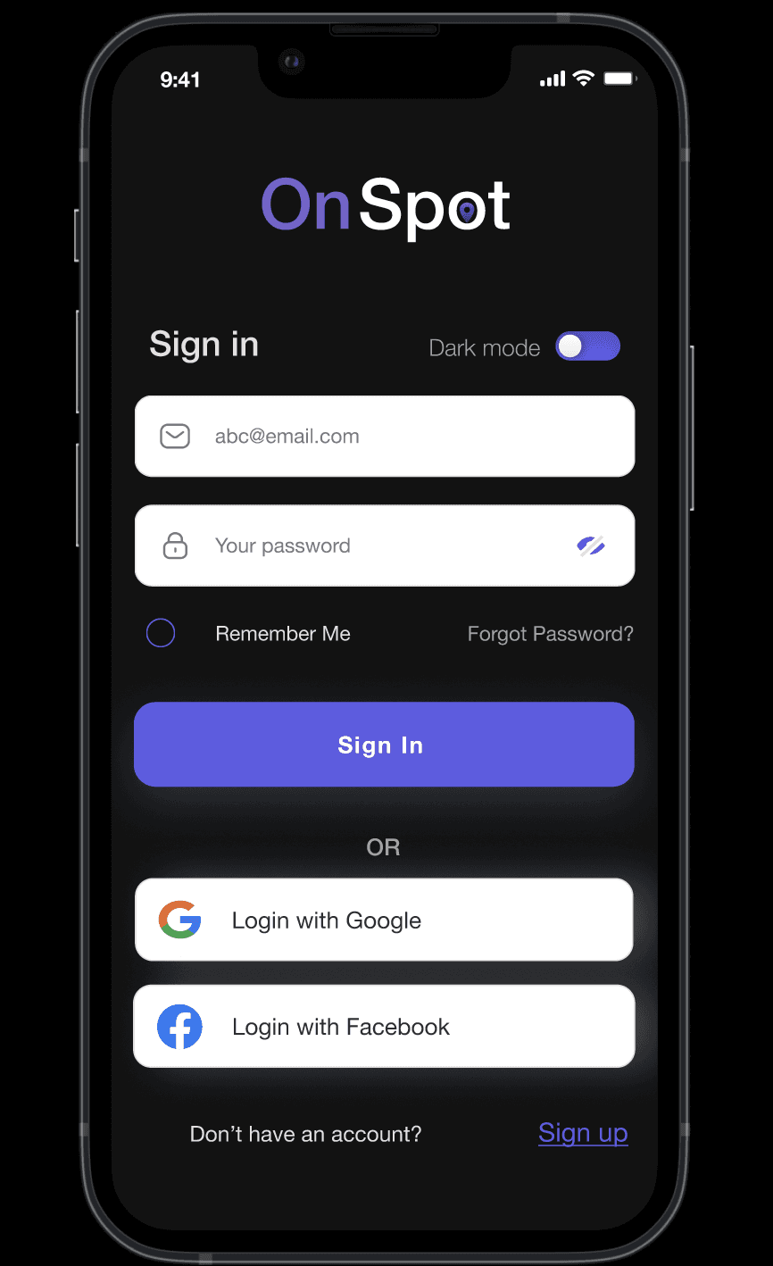
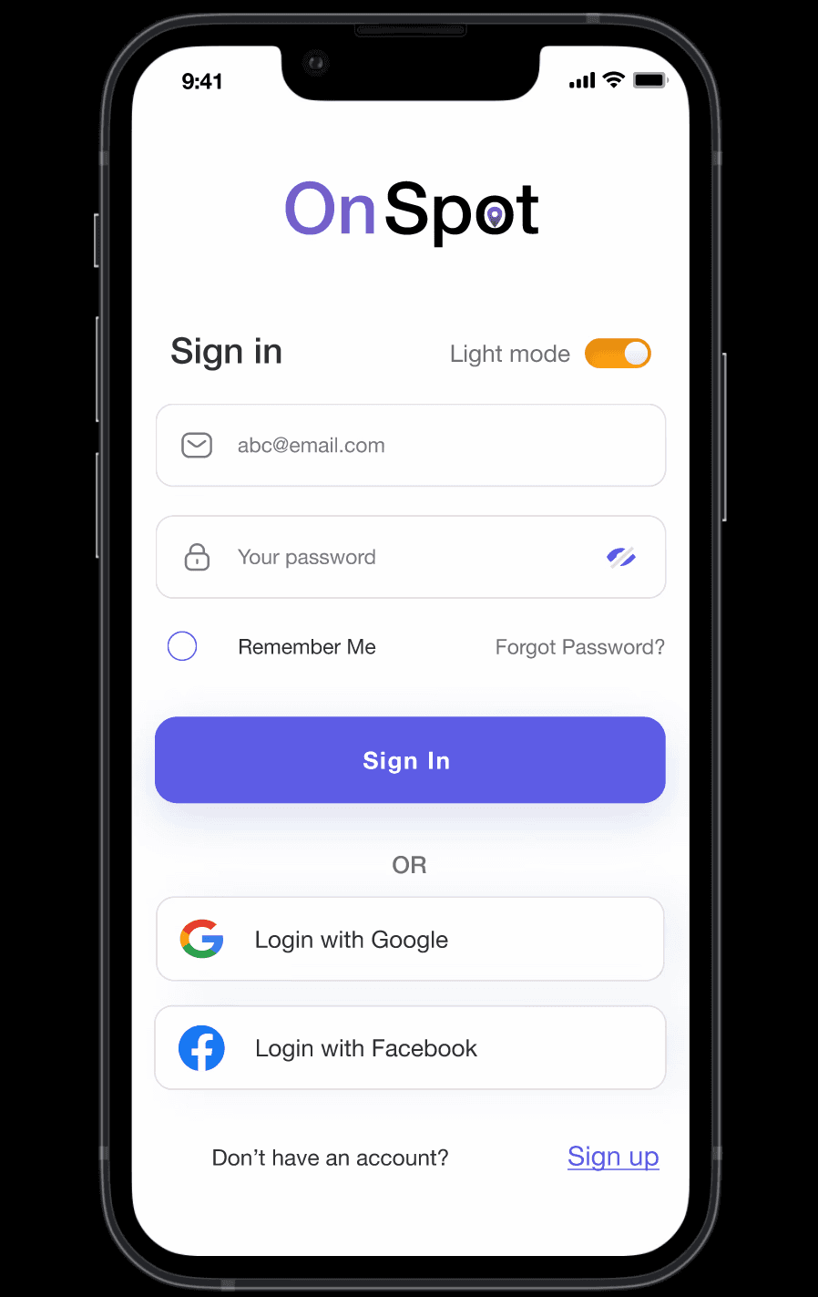
Light and Dark Mode
We decided to include a light mode to enhance accessibility and offer users more control over their visual experience. This addition ensures a more versatile and user-friendly experience.
Takeaways
Designing a social app for spontaneous meetups was a great opportunity to apply various design principles. I learned how crucial it is to balance fun, interactive features like friend connections and real-time promotions for bars and restaurants with simplicity and ease of use. One key takeaway was the value of user feedback—what seems engaging at first doesn’t always lead to seamless social interactions. Understanding user behavior helped me focus on accessibility, making it easy to find friends and events while keeping the experience spontaneous and intuitive. Conducting a competitive analysis also highlighted ways to create a unique, familiar experience for users.
Thanks For Reading!
Back To Top