
Project Vision
Challenges
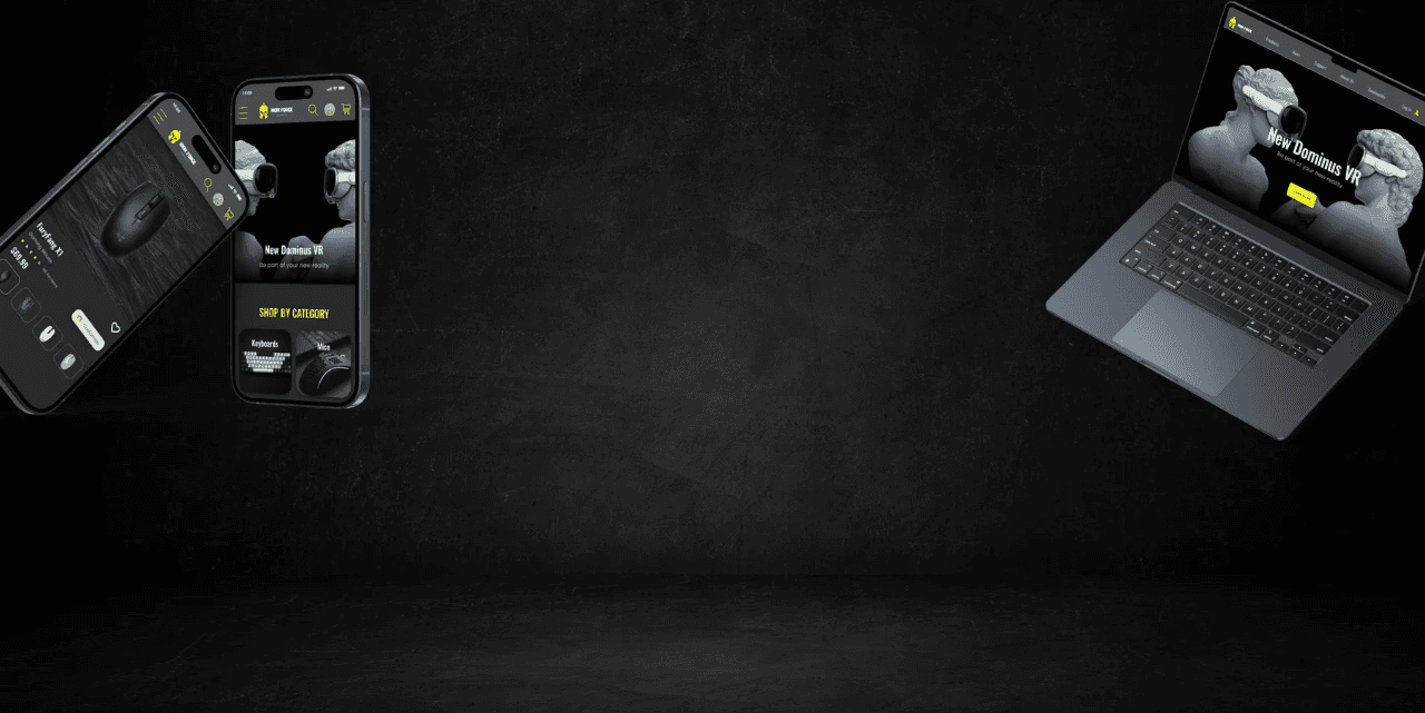
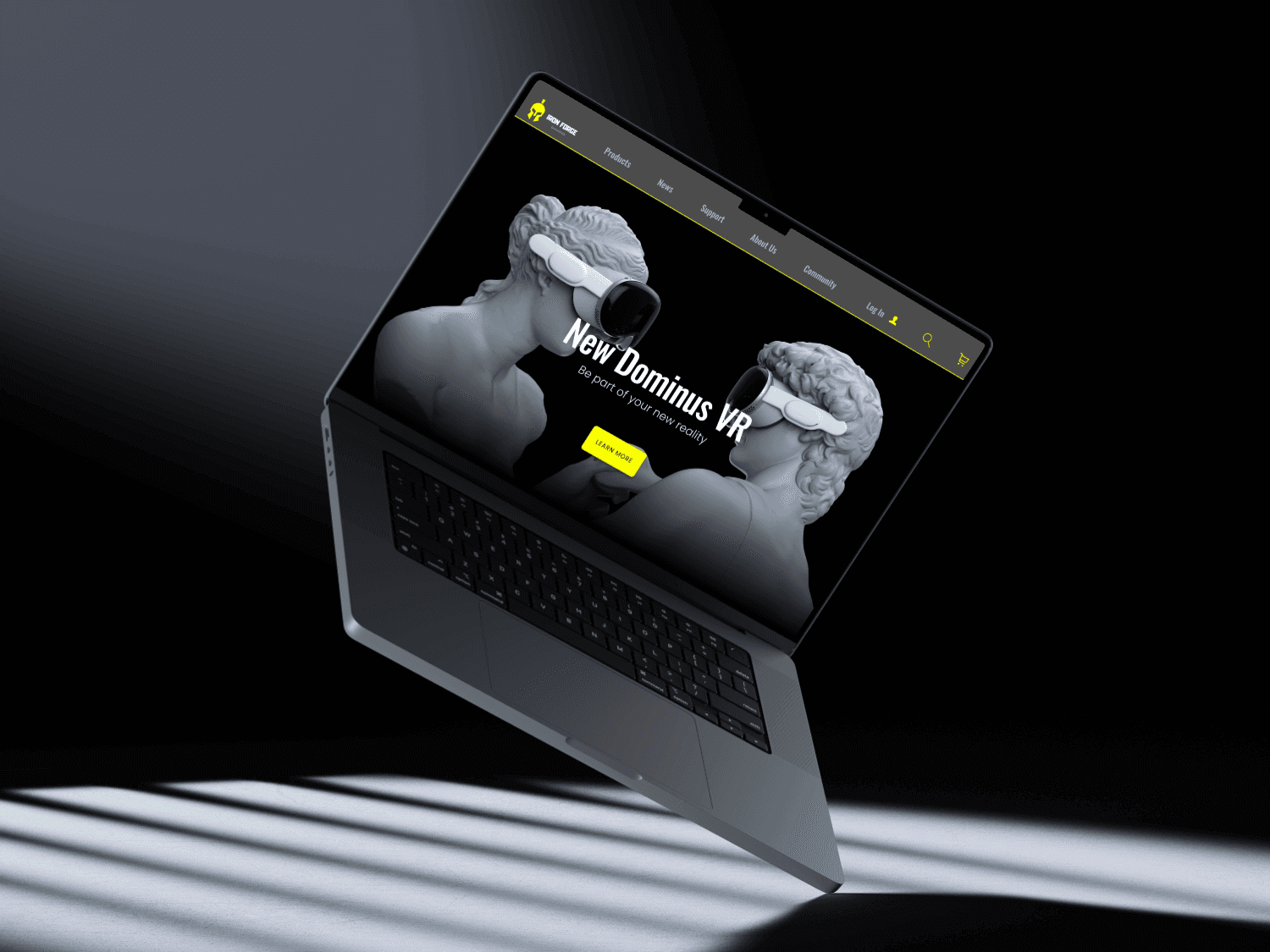
Create an engaging e-commerce platform where gamers can easily find and buy accessories. Achieving this by focusing on intuitive navigation, simplified decision-making with clear visuals and comparisons, and a streamlined checkout process. With a responsive design across all devices, interactive features, and community elements, the aim to make the store a top choice for all gaming enthusiasts.
1)
Ensure the design remains intuitive and responsive across all devices.
2)
Balance engaging visuals with a clutter-free interface to maintain clarity.
3)
Provide clear product comparisons and visual aids to help users make informed choices.
4)
Create an efficient checkout process to minimize cart abandonment and enhance user satisfaction.
Kickoff
We kicked off our project with a goal-oriented design approach, blending competitive analysis with qualitative research to shape our development. By examining what competitors were doing, we pinpointed essential features and user needs that guided our design choices. We talked directly to users and collected their feedback to better understand their preferences, and used persona hypothesis questions to fine-tune our target audience. We started out by asking ourselves some initial key questions.
"What is the product for and who is it for?"
"What challenges could we face moving forward?"
"What do our primary users need most?"
"Who do we see as our biggest competitors"
"Which users are most important to the business?"
"What are user pain points that we can solve?"
We began by using secondary knowledge from trusted sites to identify initial pain points. Next, we conducted moderated interviews with five users to gather primary insights. By creating an affinity diagram, we compared these firsthand findings with our secondary data, refining and validating the pain points based on real user experiences.
User Pain Points
1
Non-Intuitive Design
Solution:
We’ll conduct user testing to pinpoint struggles and focus on simplifying navigation, improving hierarchy, and ensuring a consistent, intuitive interface
2
Inaccessible Design
Solution:
We’ll perform accessibility tests and focus on color contrast, accessibility tools, and keyboard-friendly design.
3
Chaotic Variety
Solution:
We’ll analyze user behavior and feedback to improve product presentation with better filters, sorting, and clear categorization, as well as the inclusion of charts.
4
Poor Hierarchy
Solution:
We’ll use usability testing to identify user struggles and focus on clear labeling, navigation, and prominent information display.
Meet The Users
Primary

Name: Alex
Age: 23
Occupation: Student
Alex is a 4th year student hoping to land an internship. In his free time he enjoys gaming with his friends, he needs a simple website that clarifies benefits and price. He needs this as he does not have much free time and as a student is budget conscious.
Goals
Frustrations
Budget conscious
Unclear benefits
Product comparison
Confusing layout
Secondary

Name: Reena
Age: 41
Occupation: Nurse
Reena is a single mother with dyslexic who works full time as a nurse. She lives in Lakewood, Colorado. Reena would like to purchase gaming products for her daughter, but Reena has a hard time with tech-savvy words and navigation.
Goals
Frustrations
Efficient shopping
Tech heavy wording
Easy navigation
Complex user path
Accessibility

Name: Maya
Age: 31
Occupation: Designer
Maya is a graphic designer with low vision who relies on high-contrast settings and assistive technology for online activities. She frequently shops online for both work and personal needs, seeking clear visuals and optimization for screen readers.
Goals
Frustrations
Access friendly
Limited usability
Streamlined checkout
Unclear descriptions
Competitive Analysis


We analyzed both direct and indirect competitors, noting their strengths and weaknesses. This evaluation helped us identify gaps and opportunities to improve upon and stand out in the market.
Opportunities Found:
Personalized Recommendations
Accessibility feature customization
Interactive product comparisons
Localized Content and support
Real time customization


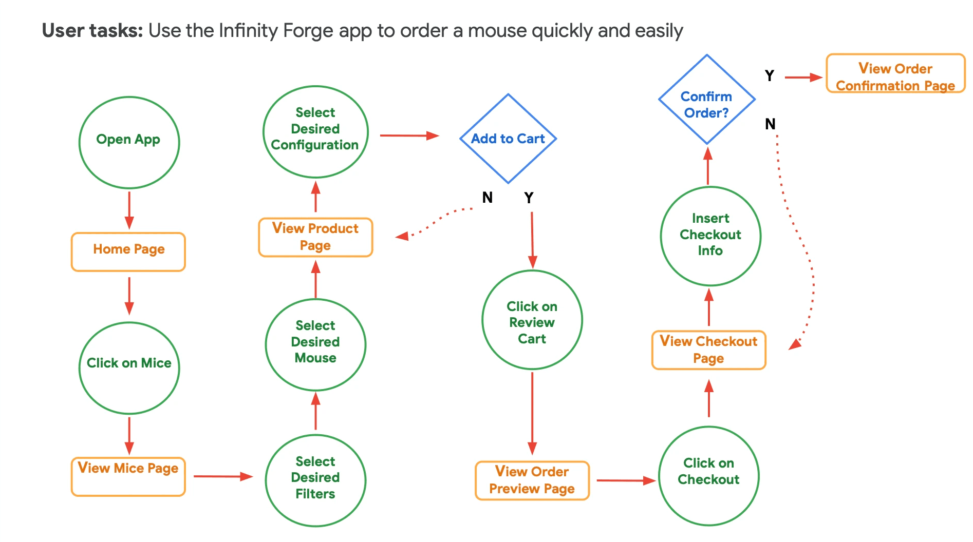
Preparing the Journey
We constructed a user-flow of what a basic start to finish journey looks like while purchasing an item. This helps us in understanding ways users can interact with the product, as well as allowing us to see navigation through user goals.
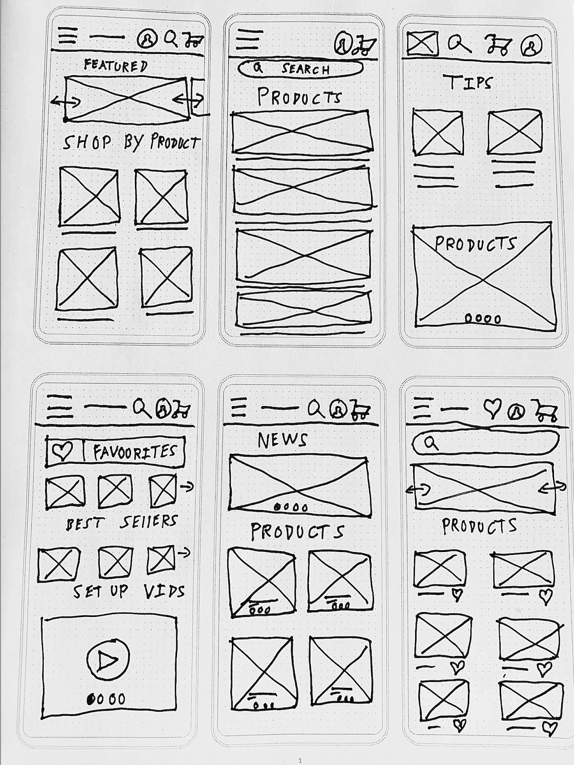
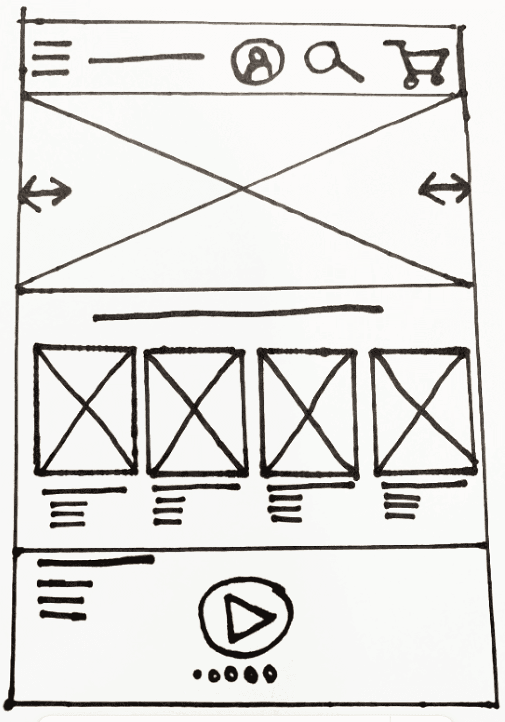
Paper Wireframes
Wireframe Homepage Brainstorms
Homepage Wireframe V2
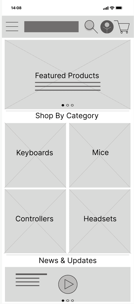
Low-Fidelity Wireframes
Low-fidelity homepage
Low-fidelity products

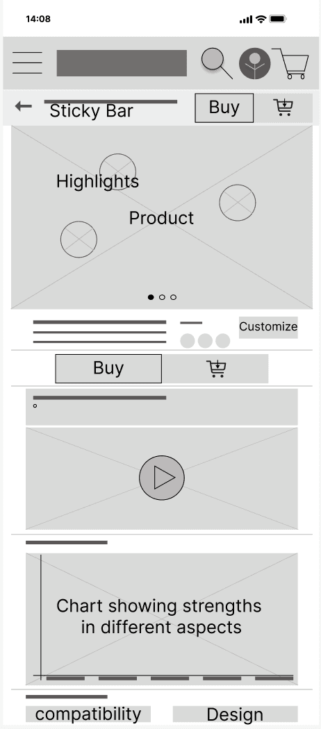
Low-fidelity product details V1
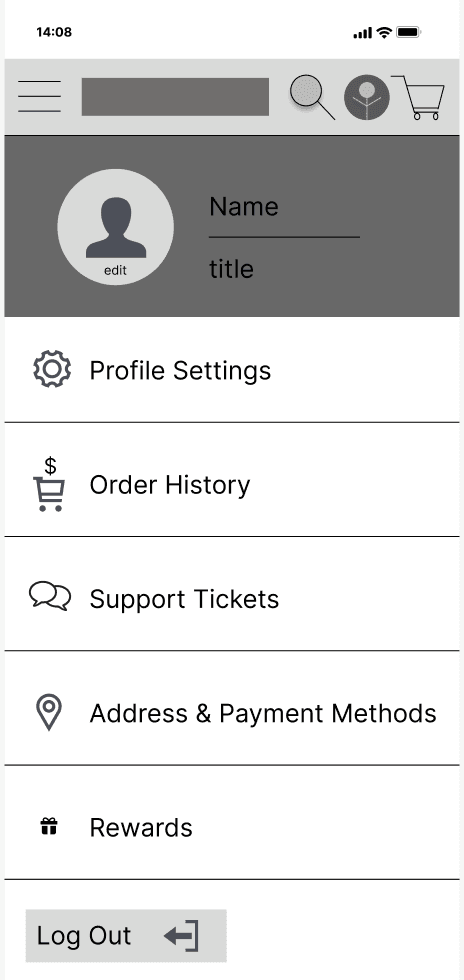
Low-fidelity user profile
Iteration
After creating the prototype from these and more low-fidelity wireframes. I prepared a 10 question survey for participants to fill out after completing our moderated usability study in addition to the responses observed during the study. This was done to gather enough feedback to iterate on for our next set of design iterations.
Visual clutter
We found that users struggled with visual clutter, making it hard for them to focus and navigate effectively.
Not intuitive
We discovered that users struggled with the interface, finding it not intuitive and challenging to navigate.
Typographic hierarchy
We found that users struggled with the typographic hierarchy, leading to confusion on the organization of information.
Visuals
We found that users struggled with the lack of visuals, making it harder for them to engage and understand the content.
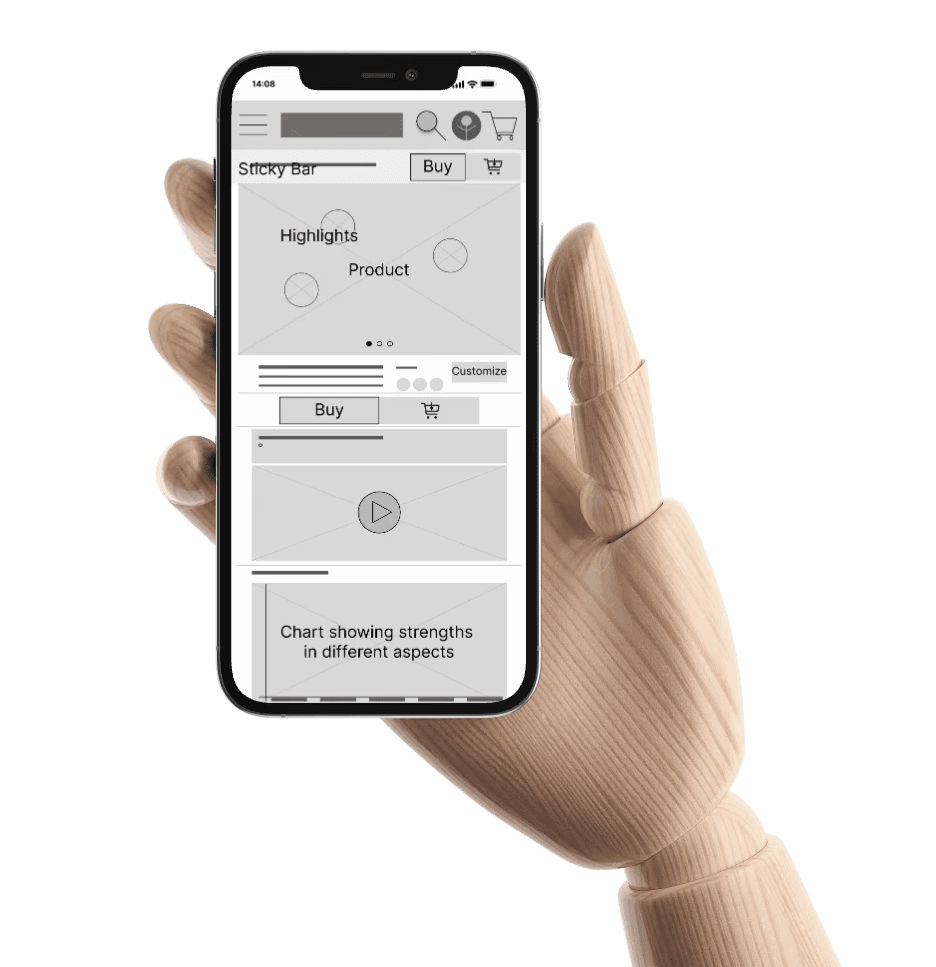
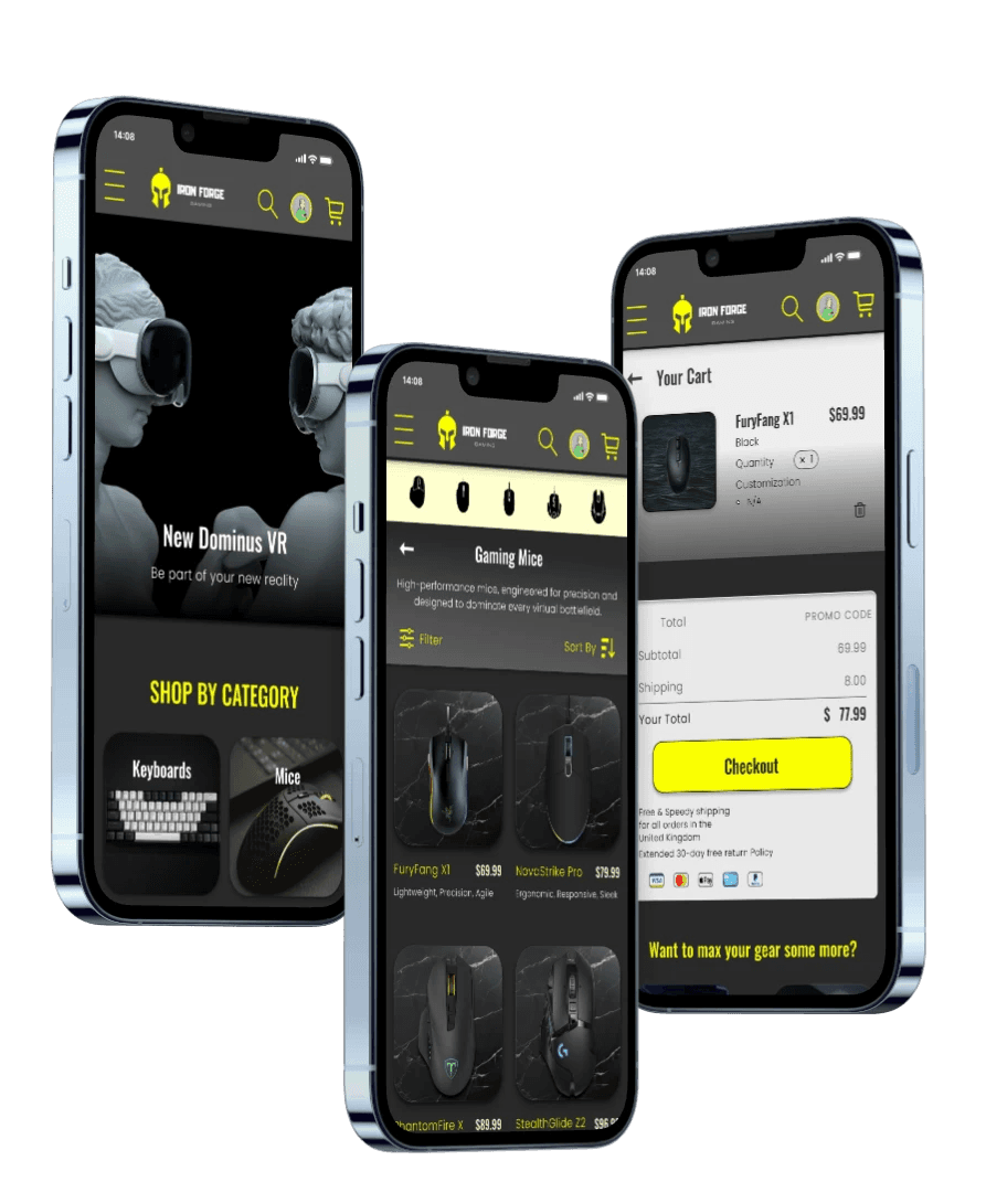
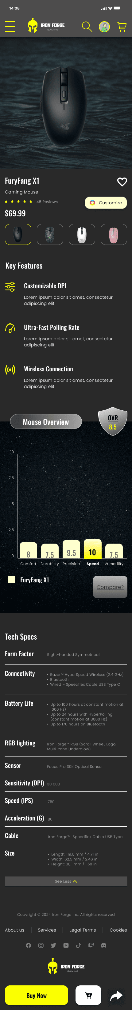
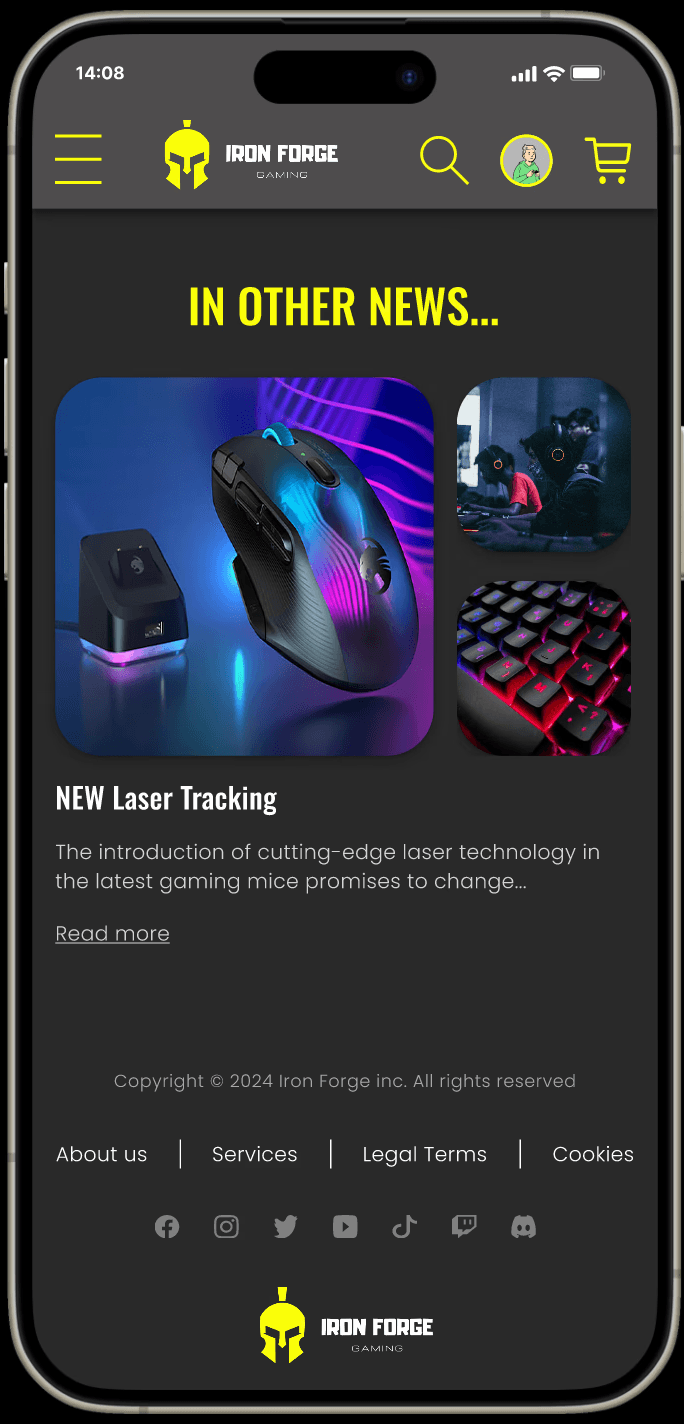
Old Product Details Page
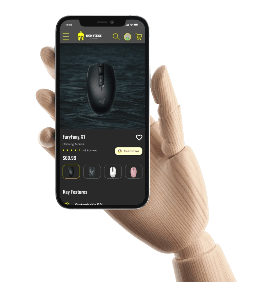
New Product Details page
CHALLENGE 1
Typographic Hierarchy
Removing the visual clutter significantly improved the user experience, making navigation clearer and more intuitive. This change allowed users to focus on key content, leading to increased engagement and overall satisfaction.

CHALLENGE 2
Hiearchy
Establishing hierarchy is crucial for guiding users through content, ensuring they can easily identify and prioritize key information, leading to a more intuitive and efficient user experience.
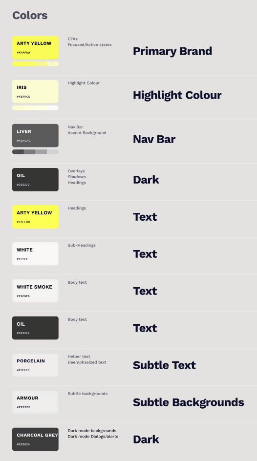
Style Guide
Using a style guide to fix the hierarchy ensured consistent, clear organization of content, improving readability and helping users quickly find key information.
Try To Hover
CHALLENGE 3
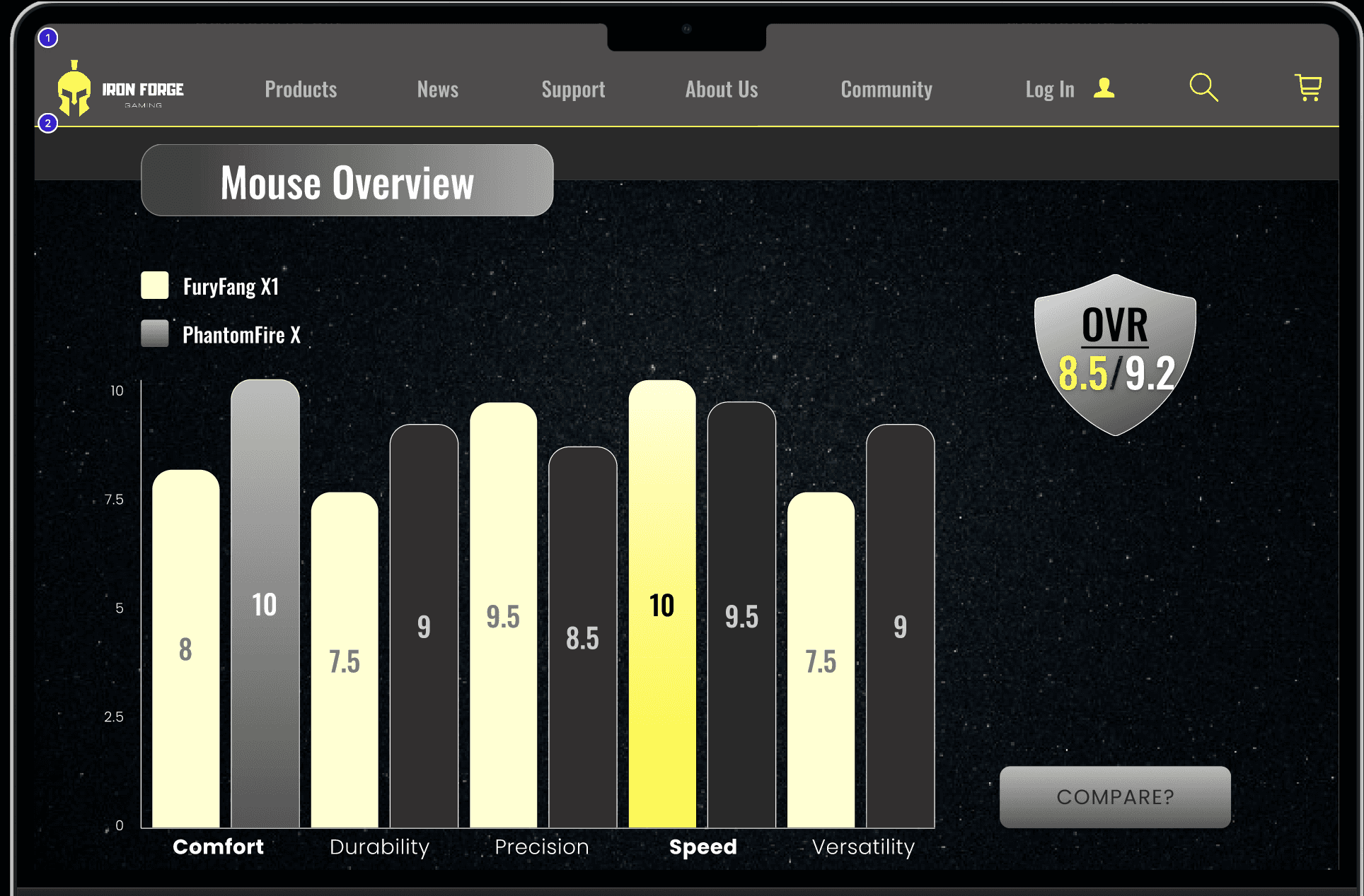
Visuals and Comparisons
We used clear visual elements and interactions to simplify item comparison, making it easier for users to distinguish and evaluate products effectively.

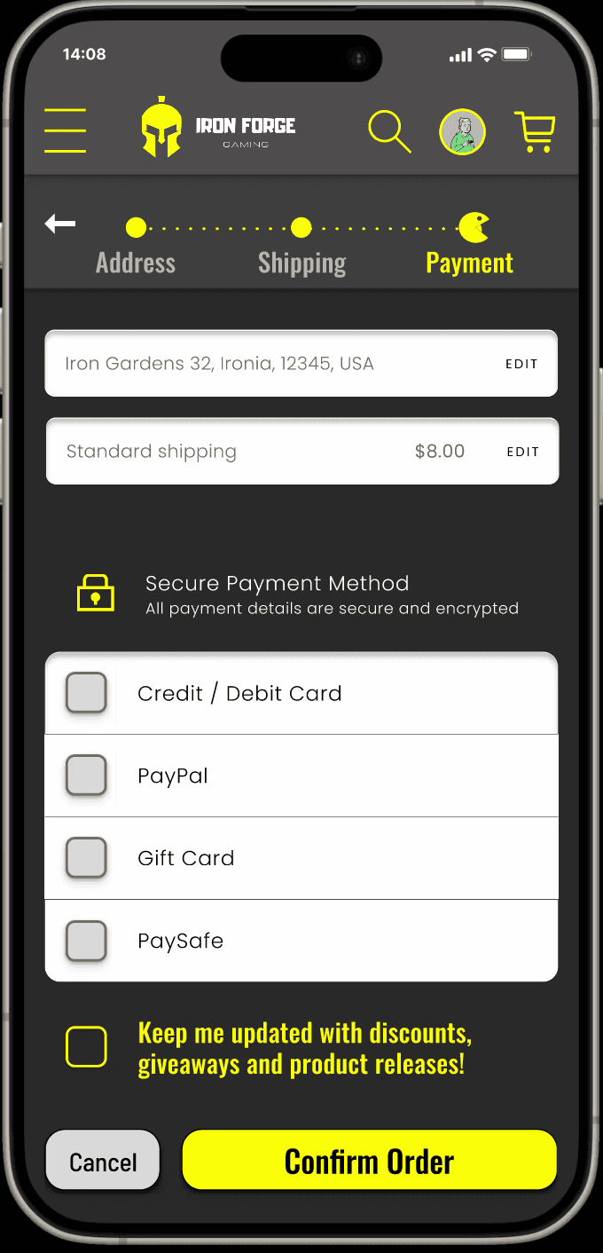
CHALLENGE 4
A Familiar Experience
To ensure user comfort, we used familiar e-commerce layouts and checkout procedure. This made navigation intuitive, leveraging recognized elements like search bars and product grids to enhance usability and ease of use.
Takeaways
Designing a responsive gaming e-commerce site was a great way to practice and learn how to use a goal directed design approach. I realized the importance of creating a balance between flashy, fun visuals and practical features. One key learning was how essential user feedback is in refining design—what looks cool isn’t always what works best. Understanding real user needs helped me focus on accessibility and simplicity while still keeping the vibe exciting and intuitive. Performing a competitive analysis, to see what was done well and what opportunities had been missed, allowed me to create a unique feel yet is still familiar to users.
Thanks For Reading!
Back To Top